People keep asking why the jujutsu kaisen anime looks like two completely different shows between seasons, and honestly they are not wrong to be confused. Season 1 hits you with polished, over-detailed shadows and saturated colors that feel almost too clean, then Season 2 throws that playbook out the window for scratchy lines and washed-out palettes that some fans swear looks like a downgrade. I get the frustration. You start a show expecting consistency and MAPPA hands you this jagged, kinetic mess that feels more like a horror movie than a standard shonen battle cartoon.
But here is the thing nobody wants to admit. That messy Season 2 look is not laziness or budget cuts like the Reddit threads claim. It is a deliberate shift toward Gege Akutami's original manga sketches, prioritizing movement and emotional weight over frame-perfect beauty. When you are adapting a series that lives or dies on how disturbing and frantic the fights feel, sometimes clean animation kills the vibe faster than rough cuts ever could.
The Season 1 Aesthetic Was a Trap
The first season arrived in 2020 looking like Ufotable's Demon Slayer had a baby with Production I.G's Haikyuu, all glossy surfaces and hyper-detailed backgrounds that made every frame screenshot-worthy. MAPPA threw everything at the wall, heavy shading, intricate line work, and colors so saturated they hurt your eyes. It worked for establishing the series as a premium product, but it also created a problem that became obvious during the Domain Expansion sequences.
When you pack that much visual information into a single frame, the action gets buried under the noise. Gojo's Unlimited Void looked incredible as a still image, sure, but the complexity of those detailed shadows and particle effects actually obscured the spatial relationships during fight choreography. You could not tell where characters were in relation to each other because the background art was fighting the foreground animation for your attention.
This over-polished approach works great for shows like Demon Slayer where every frame needs to look like a painting, but Jujutsu Kaisen is not that kind of story. It is grimy, bloody, and full of characters getting their faces smashed in by cursed spirits that look like roadkill come to life. Clean lines and perfect shading sanitize the violence in a way that undercuts the horror elements Akutami baked into the manga.
Season 2's Sketchy Look Is Actually Genius
Then July 2023 rolls around and suddenly Gojo looks like he was drawn by a caffeinated art student during a three-day bender. The lines got looser, the colors flatter, and characters' faces started shifting proportions between shots. Yuji got thinner, Megumi's hair exploded in volume, and everything felt slightly off-model in a way that drove certain fans absolutely insane. But here is where you need to pay attention to what the animators are actually doing rather than what your screenshot comparison thread says.
Episode three of Season 2, the Gojo versus Toji fight, pulled a 9.7 on IMDB not because it looked pretty, but because the animation moved like liquid violence. The rough, sketchy style lets the key animators exaggerate motion in ways that rigid model sheets never allow. When Toji spins that inverted spear of heaven or Gojo first manifests Limitless, the drawings distort and smear across the screen in a way that conveys speed and impact better than any clean cut ever could.
This shift was intentional. The production team wanted to capture Akutami's erratic manga style where panels bleed into each other and action lines look chaotic. By simplifying the line work and brightening the palette for the Hidden Inventory arc, they created this weird summer nostalgia vibe that makes the eventual violence hit harder. It looks like a memory, hazy and imperfect, which fits perfectly for a flashback about Gojo's traumatic high school years.
The horror elements benefit too. When Mahito starts transfiguring people or the Shibuya Incident kicks off, the rougher animation makes everything feel unstable and wrong in a way that polished sakuga cannot replicate. It is the difference between watching a surgical demonstration and watching a car crash, both involve bodies moving fast, but only one makes your stomach turn.
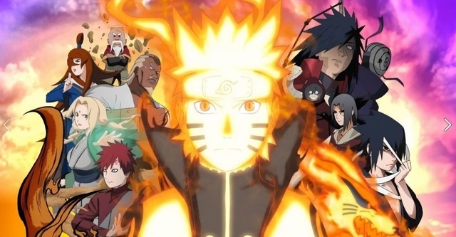
How It Stacks Against Bleach and Naruto
Now let us talk about the shonen comparisons because that is what everyone actually cares about. You have got Bleach: Thousand Year Blood War looking like a million bucks every single week, consistent as hell, traditional animation values with modern rendering. Then you have Naruto Shippuden, which went through that awkward phase where Studio Pierrot bounced between gorgeous fights and filler hell slideshows that looked like they were drawn in Microsoft Paint.
MAPPA changed everything about their approach between seasons in a way that neither Bleach nor Naruto ever really did. Bleach stays in its lane, pretty and polished, because that fits Kubo's aesthetic. Naruto got better over time but never made such a jarring stylistic pivot mid-series. JJK said screw consistency, we are going to make Season 2 look like a fever dream because that serves the story better.
Compared to Naruto, JJK handles its power system visuals way differently. Chakra in Naruto looks clean, organized, almost scientific with its hand signs and elemental releases. Cursed energy in JJK looks like pollution, black ink smeared across the screen, messy and organic. When Jogo burns someone alive or Sukuna tears through Mahoraga, the animation gets scratchy and violent in a way that Naruto's more sanitized violence never allowed.
Bleach has that cool factor, Ichigo swinging Zangetsu with fluid grace and spotless character models. JJK trades that cool factor for something more visceral. Yuji Itadori fights like a brawler, all elbows and knees and ugly grappling, and the sketchy animation captures that desperation better than clean lines would. You can see the difference when comparing how these shows handle their respective mentors. Kakashi and Gojo both cover their eyes, but Gojo's reveal in Season 2 hits different because the art gets so raw and emotional during that moment.

The Production Reality Nobody Talks About
Look, I am not going to sit here and pretend the schedule was not a disaster. MAPPA had multiple shows running simultaneously and JJK got the short end of the stick more than once. Some episodes in the Shibuya arc definitely look rough in a way that is not artistic, just rushed. There is a difference between intentional sketchiness and plain unfinished animation, and the show crosses that line occasionally.
But here is the dirty secret about modern anime production. The webgen animators working on JJK Season 2, kids who grew up on sakuga blogs and YouTube clips, do their best work when they are not constrained by rigid model sheets. The loose style of Season 2 lets them go ham with their personal styles, you can spot a Hironori Tanaka cut from miles away because those scratchy, fluid lines are his signature.
The Season 1 approach required more in-between frames and tighter consistency, which takes time and money. Season 2's approach lets them get away with fewer frames as long as the key poses hit hard. It is a compromise, sure, but one that serves the action better than slowing down the fights to preserve pretty backgrounds.
Critics call it the Pokemon style degradation, referencing how that show's animation got simpler over decades. That comparison misses the point entirely. Pokemon simplified to cut costs and maintain a weekly schedule indefinitely. JJK simplified to create a specific mood and allow for more expressive motion. One is corporate survival, the other is artistic choice, even if the choice was born from necessity.
Why This Matters for Modern Shonen
Every dark shonen that comes out now gets compared to Demon Slayer's unlimited budget approach, and that is poison for the genre. Not every show can have Ufotable's resources or Bleach's legacy budget. When JJK Season 2 dropped the polished look and went gritty, it proved you can make a top-tier action anime without making every frame look like a movie poster.
The comparison to Naruto is especially relevant here because both shows deal with cursed spirits and demons inside protagonists, but Naruto played it safer visually. Even at its darkest, Naruto never looked this unhinged. JJK Season 2 takes risks that would have gotten animators fired on a traditional long-runner like Naruto or Black Clover. It prioritizes emotional beats over model accuracy, and while that annoys the screenshot crowd, it makes the actual viewing experience more intense.
The jujutsu kaisen anime is not trying to be the prettiest shonen on the block anymore. It is trying to be the most visceral, and that shift makes it stand out against the homogenized polish of its competitors. When you watch Yuji punch Mahito's soul apart or Sukuna dismantle Jogo, the ugliness of the animation sells the brutality in a way that clean lines never could.
This sets a precedent. Future shonen adaptations might realize they do not need to bankrupt their studios chasing Demon Slayer's aesthetic. Sometimes rough and raw beats polished and perfect, especially when your story is about kids getting eaten by monsters in subway stations. The art style should match the tone, and Akutami's manga was never pretty to begin with.
So yeah, Season 2 looks different. It looks worse if you are pausing to take screenshots for your Instagram. But if you are actually watching the show, letting it move and breathe and bleed across your screen, it looks exactly how it should. Like a nightmare you cannot wake up from, drawn by someone who cares more about making you feel sick than making you impressed.